Art Director
Comedy Central, Late Night Cartoons Inc.
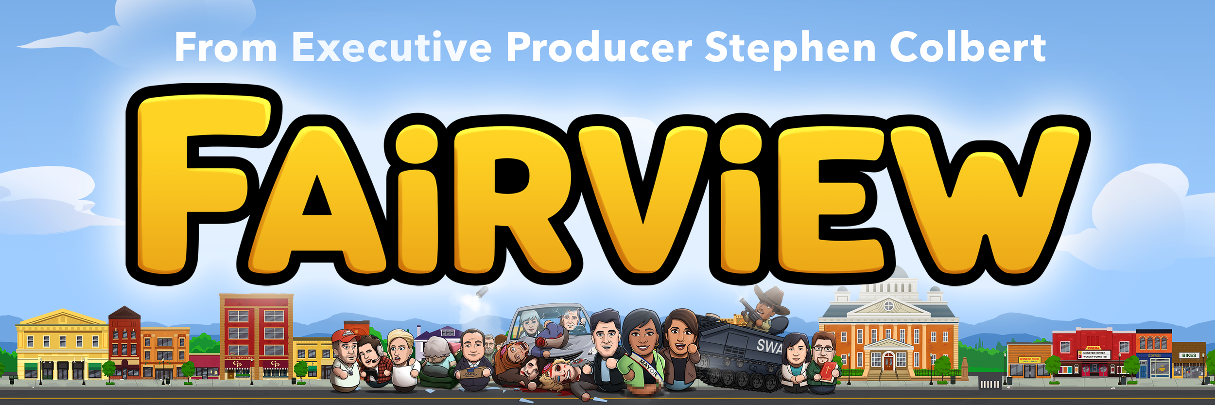
Fairview was a topical animation satire program from creator, showrunner and head writer RJ Fried, which aired on Comedy Central. It followed the exploits of a small midwestern town as they reacted to current events and national politics.
When I was brought onto Fairview as Art Director the machine was already moving: there was a budding library of backgrounds and props, and an initial character design pass, which the showrunner was happy with, had already been completed. My job was then to take the established design language find ways to increase appeal without straying from the showrunners vision, make the design it more internally consistent, and ease production.
Characters


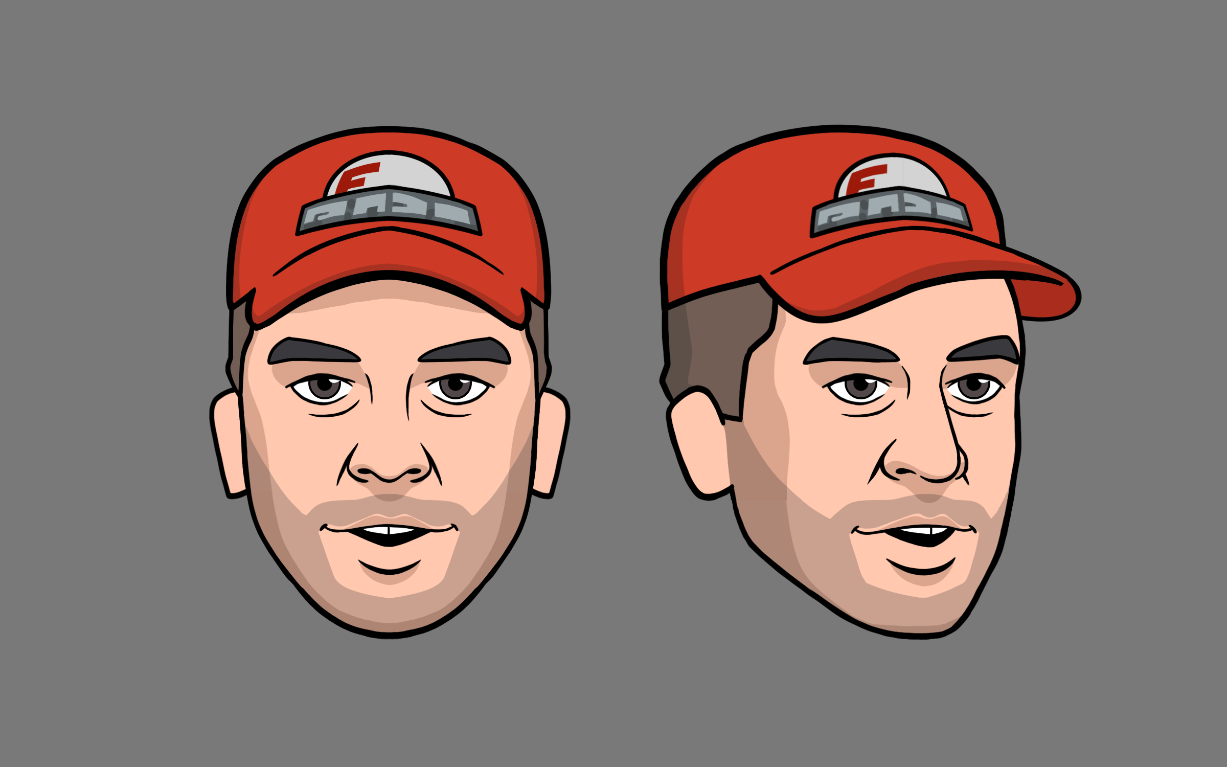
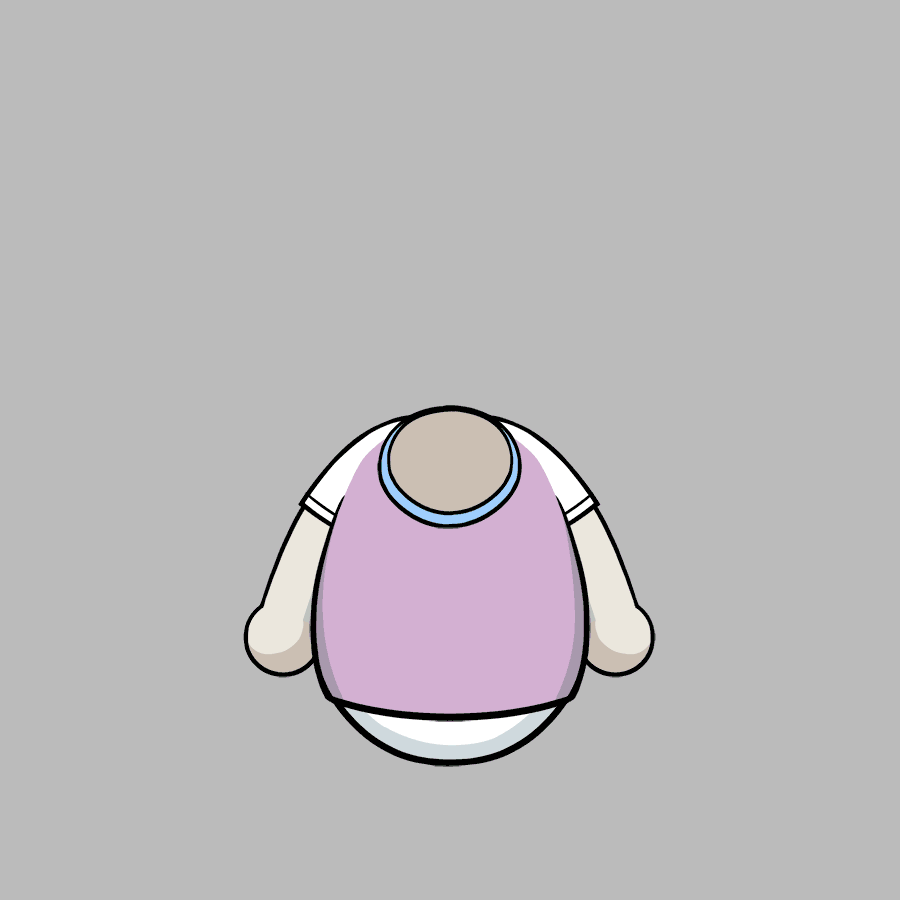
My concept in redesigning the characters was to make them feel more toy like to de-emphasize some of the anatomical questions their more realistic faces and the division in their lower part brought up. In particular scaling down their “legs,” giving them a more consistent, simple geometric shape and seeing if we could get rid of the ‘division.’
Of course it wasn’t that straightforward — there were other visual problems to solve along the way.


How do they sit? The initial design was making some confusing statements about legs — the “standing” position appeared not to have them, whereas the sitting position implied a sort of truncated stump. In the end the showrunner preferred the “squish forward+” variant.

What are their hands? In the original pile of designs there were all sorts of different hand shapes (perfect circles, squashed ellipses, a widening at the end of the arm etc.) not only that but several scripts made direct reference to thumbs (characters giving one another thumbs up etc.) so some hand exploration was necessary.
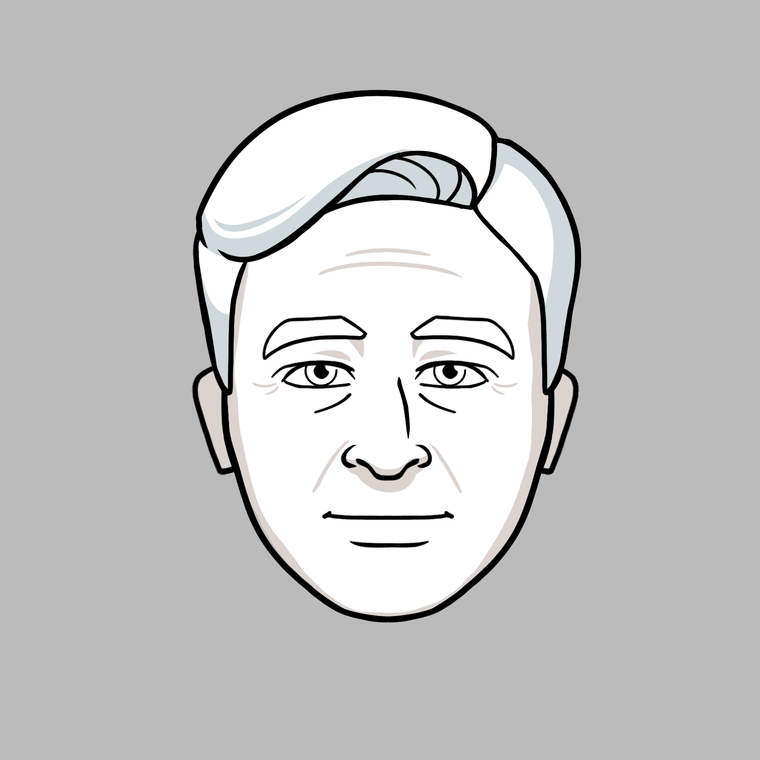
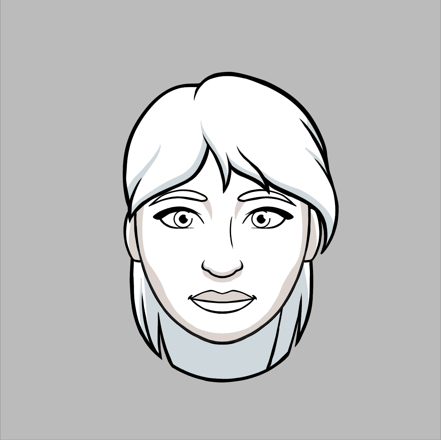
With the look established we set to work populating our cast:

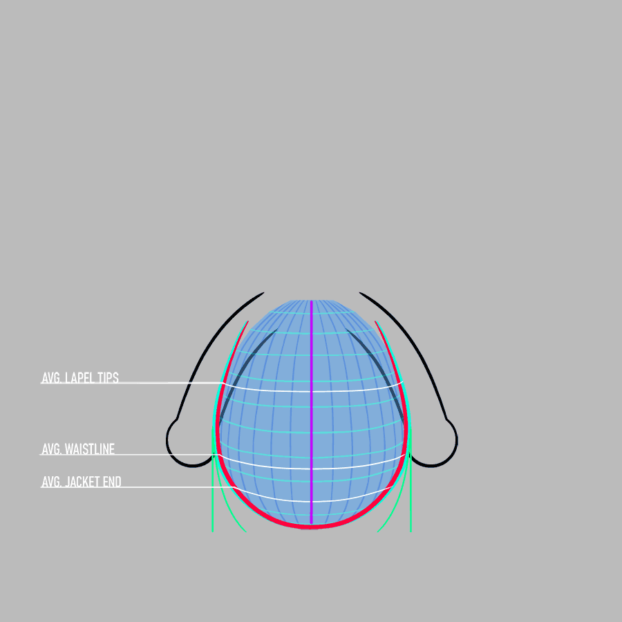
Each one of these little nerds has a full set of eye, brow, mouth and jaw shapes, a set of standard arm positions as well a 6 point rotation. Here’s a little visual breakdown of all the bits and bobs that go into a puppet:


Mutant Maker: Make Each One Unique and Make it Fast
It was clear from the beginning that the town itself was going to be one of the main characters of the show, which means we had to make a whole pile of townspeople! By the end of season one we had created more than 90 characters, each with complete turnarounds, face packs, gestures, as well as many with alternate costumes, dressings, and special poses. With so many little weirdos to make every week we needed a better system than simply designing everything fresh every time so as the season went on we built tools! Behold the Mutant Maker:
Each of these heads has 7 eyes, 7 mouths, 7 jaws, 7 noses, 7 brows 7+ sets of hair and some bonus props (glasses/hats etc.), all of which are completely interchangeable. Additionally all facial features that that would normally have them (eyes, mouths, brows, jaws) have complete animation sets. Everything is carefully layered and named so it can be procedurally re-colored. This amounts to the ability to generate thousands of unique characters with relative ease and speed.
We built out a similar system for the mass production of bodies as well, with each sleeve variation given a complete set of gestures as well as a heavily guided template for use in the creation of any new costumes. Like the heads everything is layered and named carefully so they can be quickly and precisely re-colored.
Backgrounds
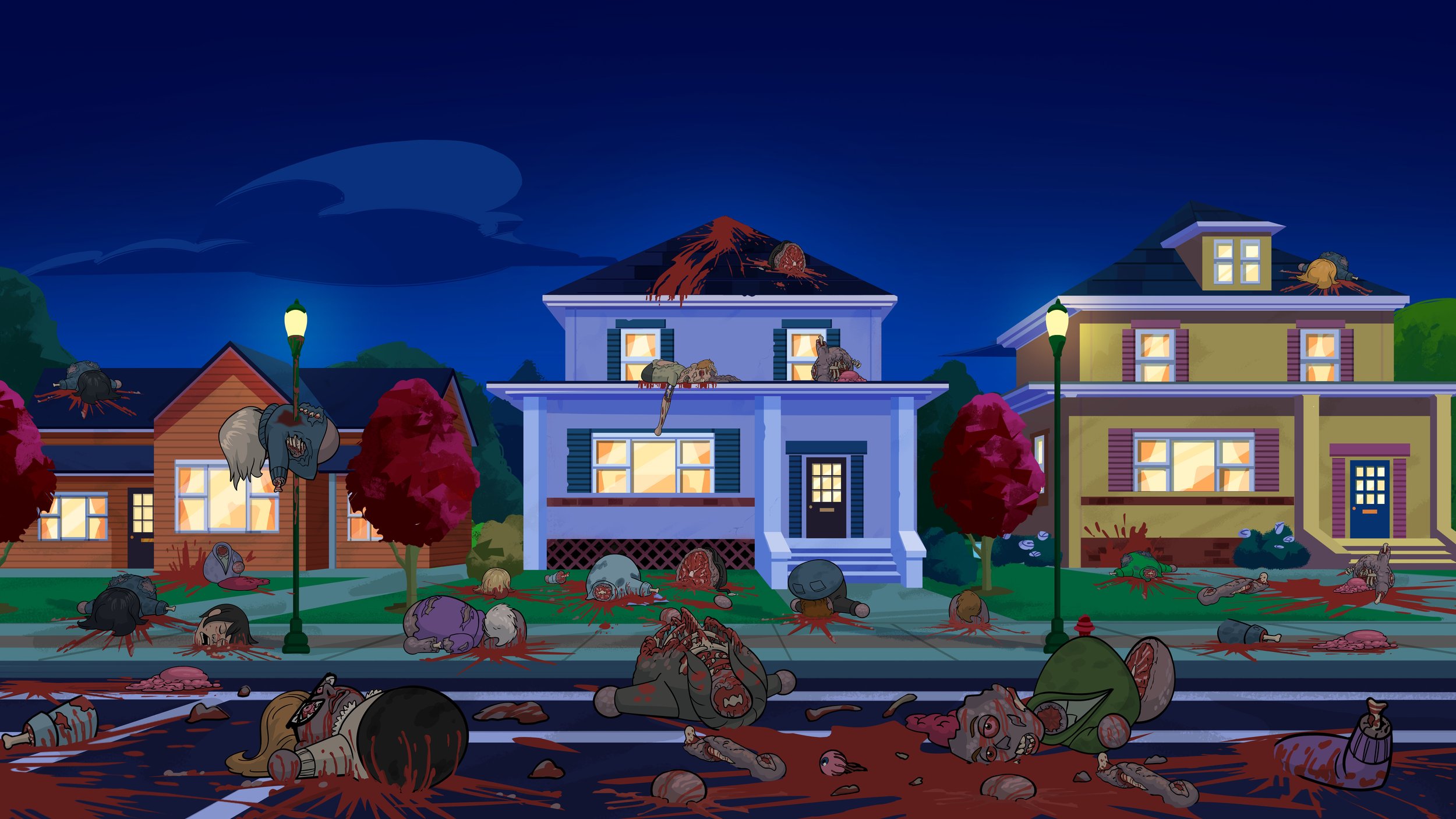
The stated intention was to go for a bright and childish tone that would stand in contrast to the tone and content of the show which was very much intended for adult audiences — loud, violent and vulgar. So with those goals in mind I set about creating a new direction for the backgrounds: increasing the scale of the detail, intentionality of the use of texture and of course resizing elements to be more appropriately scaled to our weird little egg people. All of this went a long way towards bringing the world together — and getting us a little extra distance from South Park.
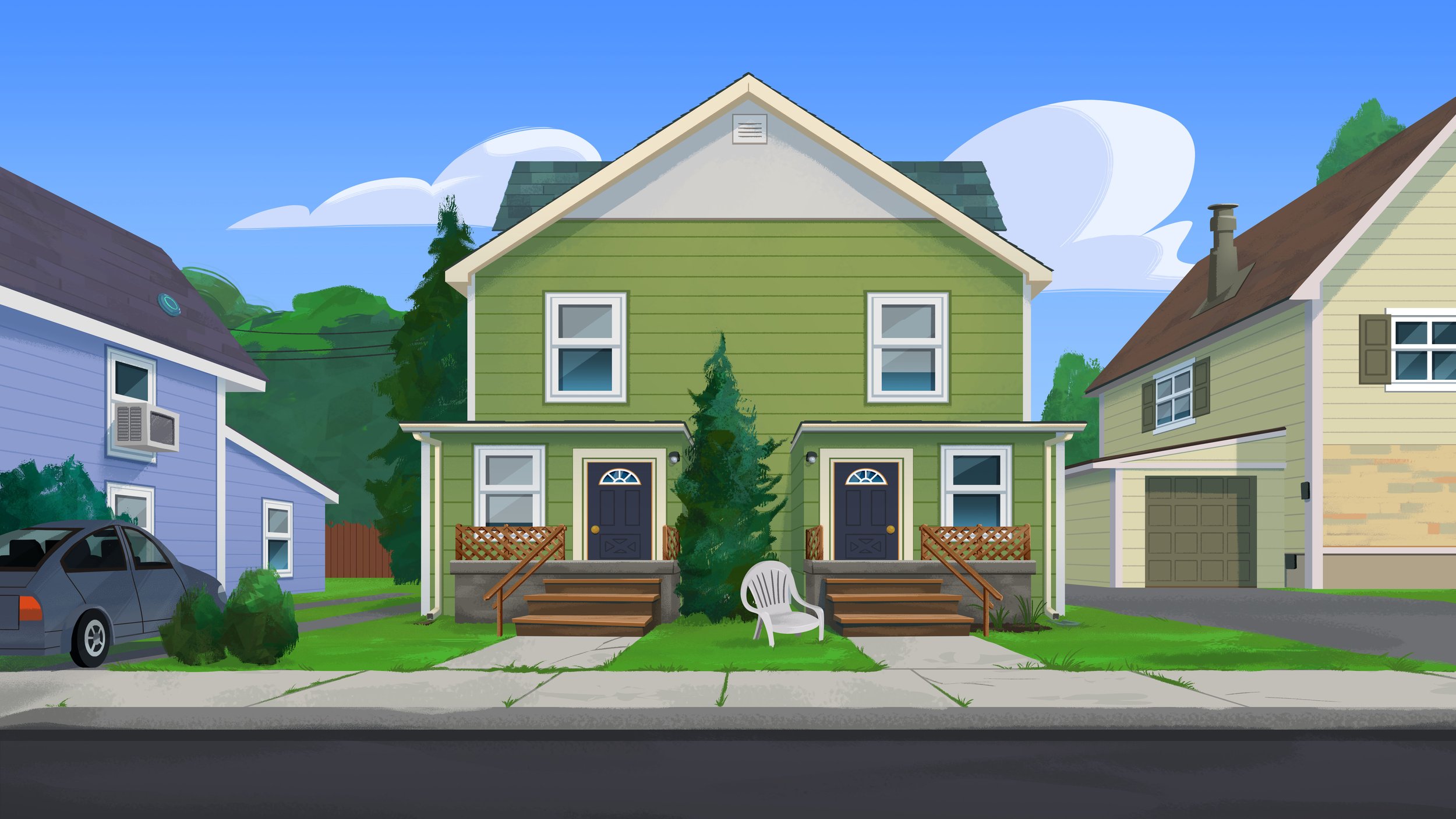
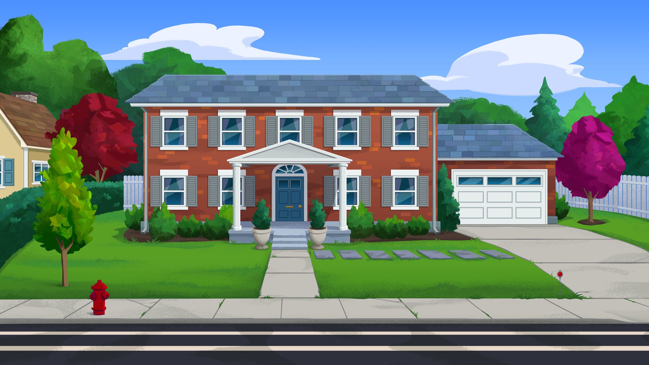
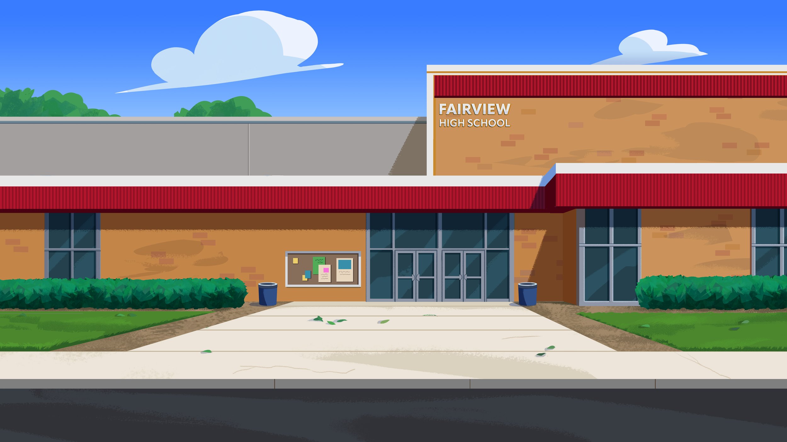
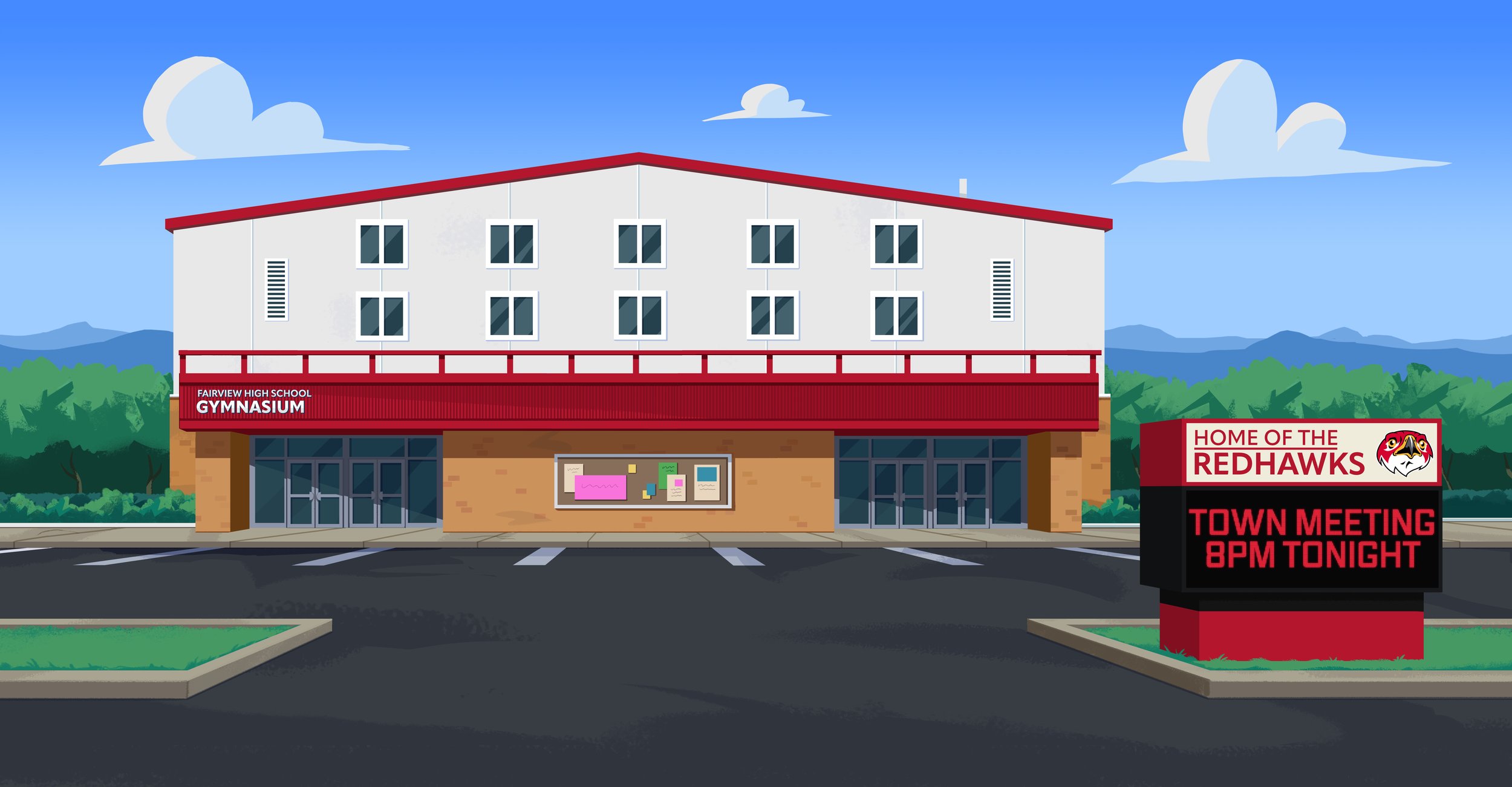
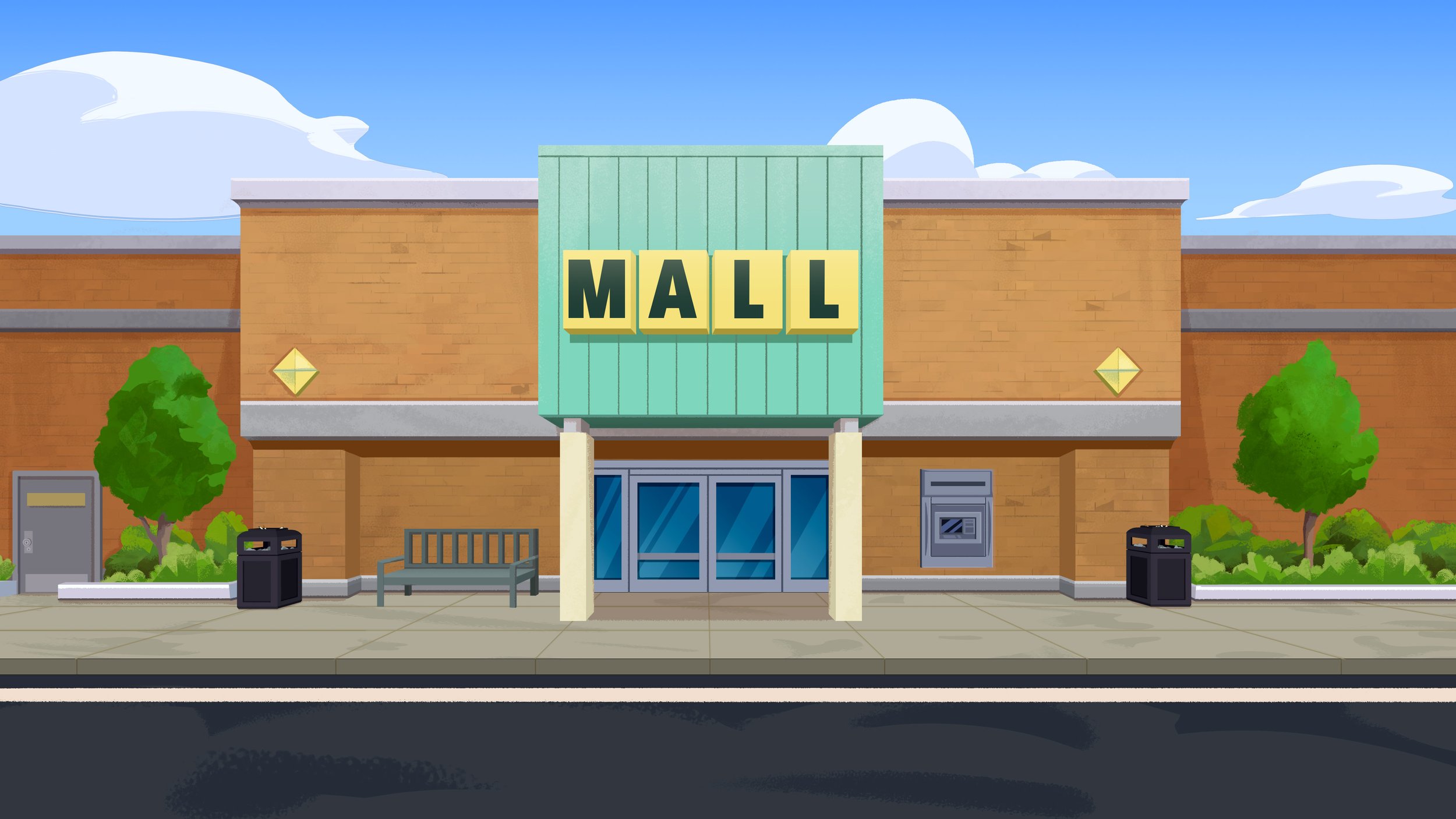
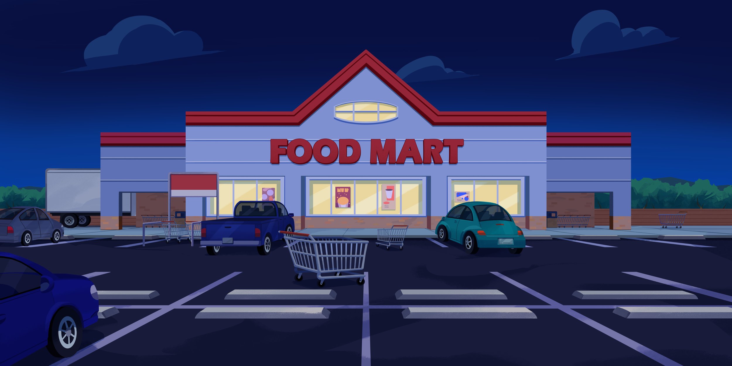
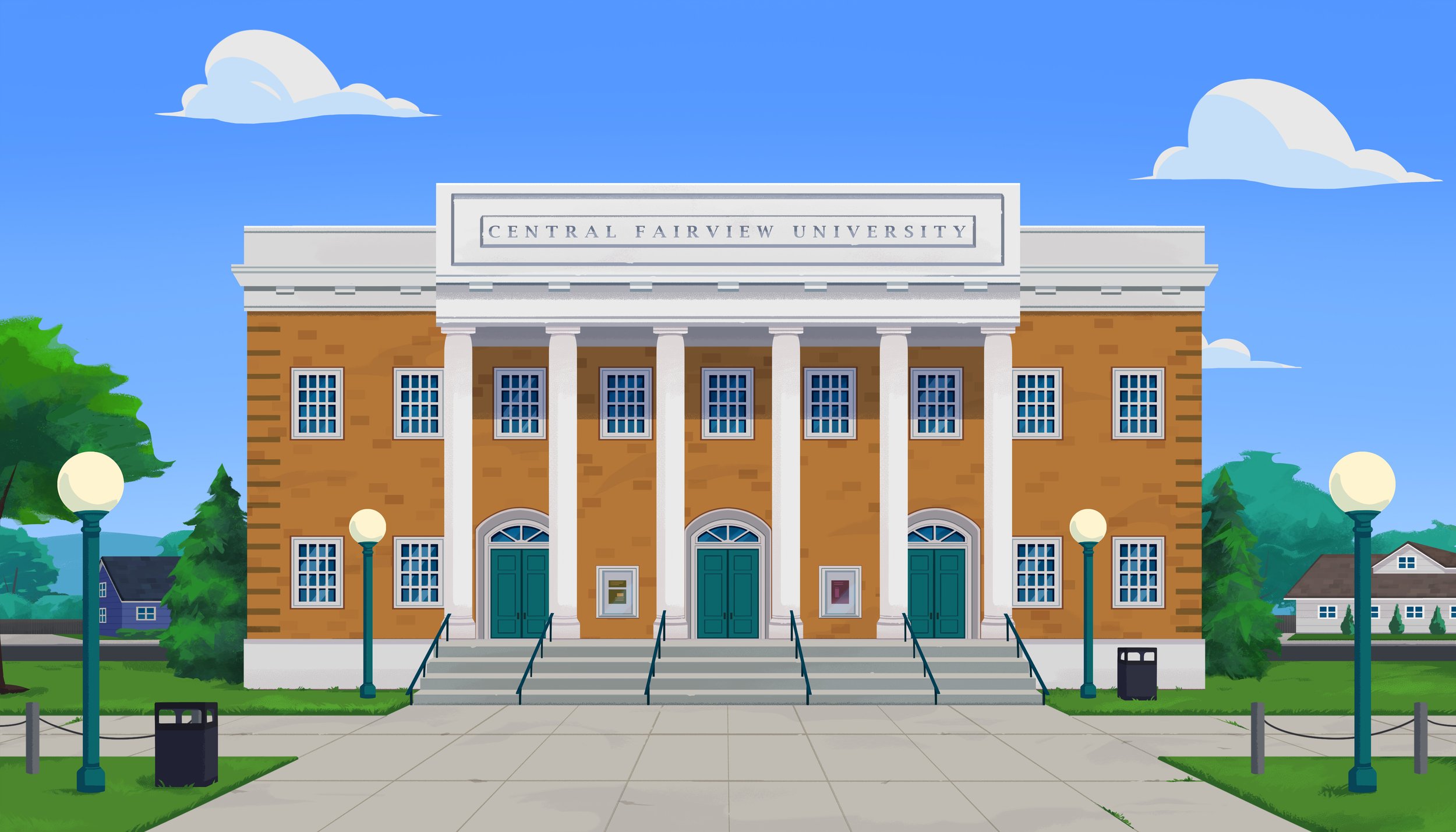
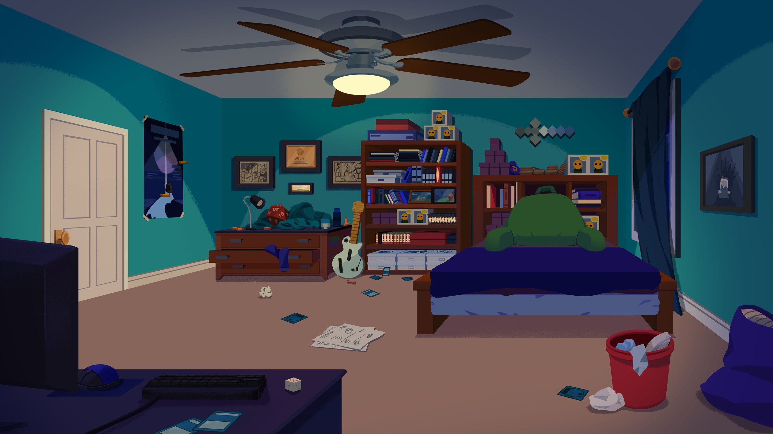
Again with the pace of the show and the volume of new assets per episode being what they were, in an effort to keep overtime, team size, and burnout down, we created tools. Since our interiors were generally boarded around eye level camera, one point perspective environments we were able to create a basic, modular room which could be used as a jumping off point for most interior environments.

As we built out our town, we pulled various furniture and props aside into a little library. Using that library in tandem with the room generator was big help in keeping up with the pace of production.

And lastly everyone’s favorite part of animation:
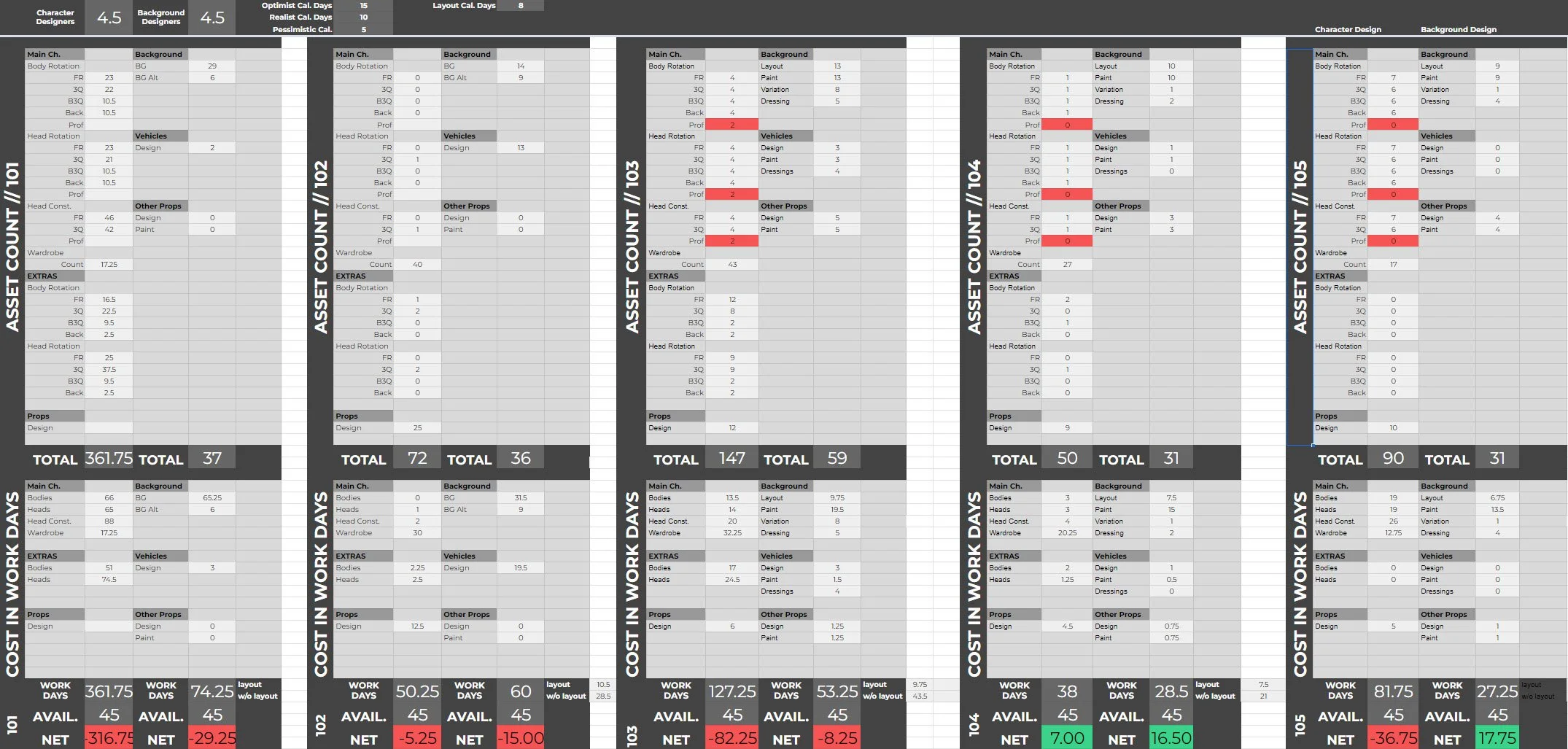
Spreadsheets!

Since our schedule was so ambitious it was crucial that we catch heavy episodes, complicated scenes, and other potential hiccups early in the process so we can alert production and the showrunner so we can collaborate on solutions to bring the episode into a manageable scope. Rather than just go on gut feelings I built spreadsheets which our script asset breakdowns for each episode could be plugged into.

Assets are tagged by type, tallied, and then multiplied by an average estimate of how long that asset type takes to complete in “work days.” Those work days are then divided by the number of artists in the applicable department giving us a rough picture of the amount of time required to complete the episode. The estimate won’t be precise but it’s a good way to see if we’re in the right ballpark. From there we can figure out solutions — alternative script or editing solutions, hiring on additional short term help, approving overtime etc.
Hey! You made it to the end! Thanks for reading, or at least scrolling, all the way down here.